Wednesday, 9 April 2014

Maths Monsters - Feedback and Evaluation

INTENDED GAME SPEC

After brainstorming this was the intended game that I had in my head.

Originally inspired by pokemon games, the intention was to have an area in which the player would randomly encounter monsters and fight them with their own monster by answering maths questions. This idea could be shifted to make it work for almost any age group but I decided I wanted to target 11-14 to ensure that I could assume a certain level of mathematics competence.
Realizing the scope of such a thing would be too great, I simplified it to a single "battle" with a succession of opponents. I added a score system to track progress and the idea was that the game would randomly generated four numbers: A, B, C and D. Using a set of those three numbers, the game would randomly use two math operations, either addition, subtraction or multiplication. I would eschew using division as it would make the game much more difficult. By equating all this information, the game would produce a Target Number, which the player would have to make by using the same set of randomly generated numbers and maths operations.
If the player get the answer correct they would gain a point towards their score and the enemy would take damage to its health, which would start at 3 and possibly increase as the player defeated more monsters. To implement a "lose state" I added a timer which would start at 15 and tick down to 0, at which point it would deal damage to the player and reset to 15. The player would also have 3 health and once it reached 0, would lose. The timer would reset whenever the player took damage or took got a question correct.
The questions would span on to infinity; there would be no win state, only an eventual loss and a highscore.

Of course, due do the nature of the time constraints, what I ended up with was slighlty less impressive.

The questions do not span infinitely: there are 9 preset questions and once the player completes them, they win. This was a great loss because the game was much less replayable and actually changed the difficulty of the game because the player could restart with prior knowledge.

FEEDBACK

Video game production is an iterative process. Once I had a playable game from start to finish I needed feedback from people not involved in its production. I recieved feedback from four play testers: Teri, Reece, John and Karl.

The question sheet I created in preparation of this stage contained what I felt were targeted but open questions, design to elicit more than one a word answer without being so vague as to overwhelm the tester into giving less useful feedback. In most cases this didn't really work but I am unsure as to whether that is a result of poor questioning or inexperienced testers.

---

What is the first thing that stands out to you about the game?

First impressions are always incredibly important, in every situation and while sometimes a poor first impression can be overcome, more often than not, the first impression is what sticks. As such, I wanted to gauge peoples initial reactions and attempt to figure out two things: Is it generally positive or negative? And, what is the stand out feature to people seeing the game for the first time?

Teri's response was :
"The art style, it’s very unique"

Reece's response was:
"The animation of the character is good because it brings it to life."

John's response was:
"The way it looks, it’s unique and the design is very professional."

Karl's response was:
"The animals you defeat and the difficulty of the questions"

From these responses I can gauge that the overall impression seems to be positive and that the aesthetics are the first thing that stands out to most people; whether that be the "unique" visual style itself or the characters. The feedback itself is short and there appears to be a reluctance to be negative or critical, as is further evidenced by later responses, which reduces the usefulness of the feedback.

---

Do the rules and gameplay make sense? Is there anything you feel could be more intuitive?

This question stemmed from a worry after writing out the instructions for the game. It seemed, long, verbose and unfortunately, unnecessarily complicated.  I wanted to figure out whether that was the case, what the main issues were and some possible solutions to those issues.

Teri's response was:
"Yes, all the rules make sense, as does the game play"

Reece's response was:
"Yes they do it took a will to get used to but it I got the hang of it."

John's response was:
"The rules were simple and easy to understand, just the time and rules makes you think very hard about the answers to the questions."

Karl's response was:
"Considering this feels like a 14 year old game not really because it makes it more addicting"

Overall, testers said that the rules and constraints of the game were not actually a problem. Some said it was difficult but got "got the hang of it" in the end. However, in practice, I noticed a great degree of difficulty in understanding and applying the rules of the game. People repeatedly didn't use the required 3 numbers and would often try to use the same math operation twice, neither of which is allowed in the final game.

---

What do you think about the visuals? Are they appealing and readable?

Here I was attempting to ascertain how distinct different visual elements were and how the visual style would be recieved. If there were any problems I would, of course, take them into account.

Teri's response was:
 "Very appealing, however the instructions seem too long/ small to read"

Reece's response was:
 "Yes the text and questions are clear and they colours are contrasting."
 
John's response was:
 "The visuals were a strong point to this game, very cartoony yet nice looking and blends in well with the games design."

Karl's response was:
"Yes they are"

First point of real contention from the feedback, Teri said that the instructions were "too long" and too "small". Looking at the instructions screen I agree entirely. As I feared previously, the insctructions are overly verbose and having the text be so small definitely wouldn't help people. I also worry that the wall of text means the player is less inclined to actually read it and take it in, whereas if it were broken up ages a few pages it would be much less intimidating.

The rest of the feedback was very positive and overall I am very proud of the quality that I achieved visually.

---

What about the sound and music? Is there anything out of place? Is the music unobtrusive?

When I created the music track for the baackground, I didn't have a great opportunity for experiementation: trying to write music without an actual keyboard in front of me was surprisingly difficult. As such, I kept the music very simple but also, very short. I was very worried that the loop would get very repetetive. 

Teri's response was:
"Very simple yet it suits the game"  

Reece's response was: "No there was nothing out of place and the music went well with the game."

John's response was:
"I liked the music, makes playing it less empty and the sound effects were simple yet effective."

Karl's response was:
"No it isn’t it suits the game very well and gives a very nice background theme which helps players concentrate because it blocks off the rest of the world"

Again, it appears my fears were unfounded as all the testers said that the audio was appropriate with the games style and wasn't at all annoying.

 ---
How is the difficulty? Does it tend towards later questions being more difficult? And are the hardest questions too hard, the easy ones too easy?

The difficulty curve in the game is quite difficult to approximate due to the relative difficulties people have with different questions. Nevertheless, I tried to frame the question in such a way that I could gauge where people were struggling.

Teri's response was:
"Later questions do seem to be more of a challenge, however that is what makes this game good, it gives people more of a challenge as you go on, so you learn how to solve more difficult equations/ problems"
 
Reece's response was:
"It was not too difficult and the questions get harder throughout the game, however because there was a timer it gave me a challenge which made it harder for myself."
 
John's response was:
"I found the game difficult due to its time limit and the rules in place but, I believe once you play for a bit, you get used to it so, the difficulty is good enough."
 
Karl's response was:
"I think the difficulty for age group is perfect because it makes it challenging which is good practise for maths"

The response was people was that actually the difficulty was just fine... which seemed to contradict the failure rate. I had intended the game to randomly generate its questions. If that had been implemented, many of the testers would not have gotten past the second question. This time, it seems, observation trumps verbal (or written) feedback. I futher tested it at home with family and both my younger brother, who is sixteen, and my mum and step-dad who are 30+ all struggled with the game. They made a few suggestions that I will touch on later.

Difficulty is definitely something that needs adressing.

---


Did you notice any glitches?The intention of this question should be blindingly obvious.

Teri's response was:
"No glitches"

Reece's response was:
"There were no glitches through the game and it ran smoothly."

John's response was:
"No."

Karl's response was:
"nope"

Currently the game seems gltich free... of course, thats not the whole picture; the music loop, for one, doesn't loop properly. That seems to be an issue with the individual browsers since the problem is much worse in Mozilla Firefox than it is in
Internet Explore. As such I'm not entirely sure what I do about it.


---

What age group would you guess this is aimed towards, keeping in mind both aesthetic, gameplay, context and difficulty?

Here I was trying to ensure that I was targeting my desired demographic correctly.

Teri's response was:
"I would say ages, 8+"

Reece's response was:
"I would say it was aimed at a 9 year old because the questions were not too difficult, the colours and the way the characters looked friendly."

John's response was:
"I would say, 11-14 due to the challenge of thinking under pressure and the rules in place."

Karl's response was:
"12-14"

My actual target was 11-14 year olds. As such, only John guessed correctly, Karl was close and Teri and Reece underestimated my targeted age group. I am unsure as to Teri's reasoning but Reece's response about "the colours and the way the characters looked friendly" leads me to think that it was the child-friendly aesthetic that led it to look like it was targetting a younger audience than intended.

---

Any further comments?

This was a chance for the testers to give criticism about the game in case they had noted something that hadn't been adressed in any of my own, targeted questions.


Teri's response was:
"No, good game!"

Reece's response was:
"No"

John's response was:
"N/A"

Karl's response was:
"Nope great game very addicting and enticing"

Again, very little in the way of useful commentary.

---

PERSONAL THOUGHTS

After recieveing a lot of feedback I realised a lot of issues with the games current incarnation. I want to first talk about less important issues and how I would fix those before moving onto some more major and conceptual issues.

One issue is the difficulty and complication of the rules. They were not intuitive as shown by me needing to explain it to every one who played. Of course, the rules were on the front page... but the text was far too compact on one page. To fix this I would increase the font size and spread the information across a number of "pages" which the player could click back and forth through with screenshots and diagrams to aid the explanation.
Also, a suggestion I received from my younger brother was very good. He said that when the player clicks "card" it should grey out or demonstrate visually that it can't be used again. I believe this is a good solution for those who skim read the instructions.

Another issue that wasn't brought up by any tester but is something I noticed myself, the player would focus entirely on the bottom section of the screen, only glancing up at the Target Number. This created two problems. The player would struggle in keeping an eye on the timer and as such would never know how much time they had left. And secondly, all the work put into designing, creating and animating characters/monsters was wasted since the player never looked at them. I came up with two solutions, the effectiveness of which are yet to be determined. One would be to move the GUI so that it surrounds the characters and also increase the size of the characters. This would also help with the issue of empty space not being utilised. The other solution would be to move the enemy monster closer to the player as the timer ticked down, visually giving the player a clue as to how close they are to losing health.

Also, the lack of attack animations for the characters means the action is essentially non-existent. The player is very removed from the characters on the screen and while the audio cues help, visual elements would improve the experience drastically.

How would I improve the game? I could implement these changes but I think the game as a whole needed to be different. If I had to time to improve it, I would start again. I would use only two numbers to create the final answer and randomly create the questions to improve replayability.This would also have the added effect of lowering the difficulty and making the game much easier to create and therefore polish. Also, it would give me time to look into creating a dynamic difficulty curve that would increase the difficulty as the player answered more and more questions. Another thing would be to change up the UI, and increase the character size to fill up more of the screen.

Overall, the final project is still a fun game but not what I had originally intended.

Saturday, 1 February 2014

Sci-Fi Project Rework

Research
Concepts
Modelling Process
Final Model
Evaluation

[What has changed from initial submission.]

RESEARCH
Reference sheets and visual research that is linked to the concepting stage of production.

https://docs.google.com/presentation/d/1IzWuC3fhbVG2jp5IV0HCOrM_rJ32iRdKQPunYwG-LS0/edit#slide=id.p13

CONCEPTS
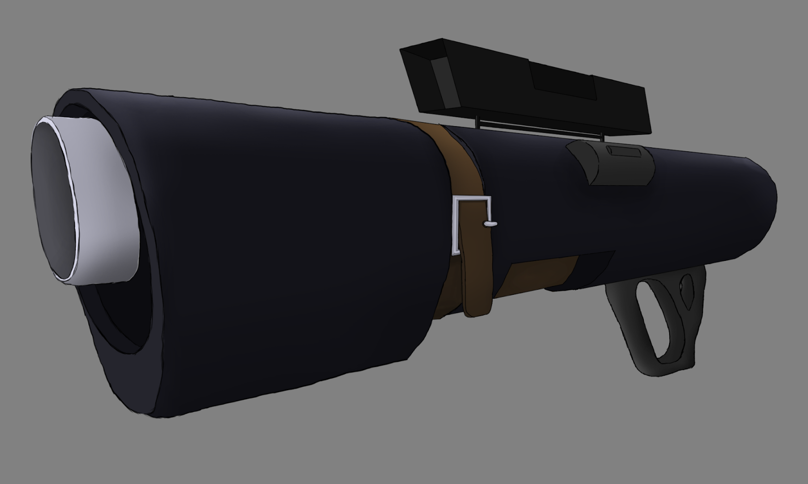
This document contains my set of initial concepts for a shotgun of some kind. As I went on I decided to incorporate more long range elements into the design as I quite enjoyed the gameplay of Borderlands where shotguns could sometimes have scopes. This allowed the player to get satisfying headshots with an incredibly potent weapon from a medium distance, a gimmicky thrill enhanced by the context of using a shotgun. As such I started incorporating scopes into the design despite its apparent contradiction to the typical design of a shotgun from a desire to pursue similar (imagined) gameplay.
This next document shows my experimentation with different designs around the same concept. I tried taking it in different directions whilst still retaining the core of the design.
This image is my final concept for the shotgun, a showpiece for enticement concerning the idea.

MODELLING PROCESS
After the design work was done and I was satisfied, I moved onto the actually creation of the Shotgun. Due to the shape of the gun, I wanted to started with a cylinder. I used a stretched box for the s

FINAL MODEL
These are some screenshots from the real-time program Marmoset included with Quixel's dDo.


And this is a screenshot with the asset in the Unreal Development Kit.


EVALUATION
Overall the I felt my final result was pretty good. A few small texture errors hinder it from being perfect: namely the normal map for the main body and some errors with the textures around tight spots, as well as the foreward grip being metal. However, the main grip really turn out great and I'm very happy with the detail I managed to attain through creating a high poly mesh in Mudbox and then baking out a normal map, it turned out great. If I were to fix those few small errors I would be very proud of what I had achieved- at the moment I am merely happily satisfied. The complexity of the design really improved on my previous model, which was the main reason I had decided to create something from scratch.

Tuesday, 28 January 2014

What is a Game Engine?

A game engine is a piece of software that is used by developers in order to create video games. Previously, all games were created from scratch each time, requiring a rewrite of the same kind of code for displaying the graphics, accepting input, processing sound, managing gameplay elements, AI, etc. This was especially aggravating when creating games similar to each other since that would mean writing very similar code over and over again. Furthermore, before game engines, creating and designing content using assets was often-times hardcoded which meant most level design was done by programmers who typically have a poor track record for being particularly artistically minded.
Of course, after a while of doing this, some bright sparks had the idea of creating a stable base, which contained all these non-specific game elements from which games could then be created from.
Nowadays game engines are often created in house for the specific needs of the company and the kind of games they create. Despite the frequent specialisation of company's towards certain genres and types of games, the engines themselves are designed to be quite generalised. This is due to a few factors, including the rapidly changing desires of the market and also the possibility of selling licenses to other companies. Epic is the most obvious example of this. Creators of the Unreal Engine, Epic frequently sells the right to use the engine for other companies to use for their own games, from which Epic takes a cut of the sales. This has provesd quite lucrative and most games released by Epic are closer to tech demos and advertisements of the capabilities of their engine than actual commercial ventures in and of themselves.
But I digress, because first we should discuss what the engine does.
The most noticeable thing that a game engine handles, from a consumers point of view, is the graphics rendering. This is done in real-time (meaning every second thirty frames are rendered) because of the interactive nature of video games. This means games engines have be fast.
The next part the game engine handles is the player input, from a mouse, keyboard, controller, joystick etc, etc. This is what allows the person in front of the screen change what is happening behind the screen.
After receiving input the game engine has to simulate everything in the background. This includes AI, physics, triggers, event, loading and unloading and changing variables. In simpler games the game simulates these things every frame. However, for more complicated games this would cause massive amounts of slowdown, lowering the frame rate and making it an unejoyable experience. As such, many game run the simulation at fixed intervals and the engine then interpolated between the two simulation snapshots, displaying this interpolated information through the graphics. Of course this comes with its own set of problems such as AI not updating to new stimuli often enough or physics being inaccurate but for the most part this method works well.
AI is "artificial intelligence", a routine in the game program as a whole that controls nonplayer characters and allows them to make decisions. It often determines where the AI can and will move (with the aid of path nodes or a Names) and when it will take certain actions.
Physics are a part of the simulation that tries to mimic the natural movement of objects due to unscripted forces. There are actually pieces of middleware such as Havok that is "plugged in" to the engine and handles the physics itself without the programmers having to write an entire physics engine from scratch. Physics also handle any of the collision of a game, making objects solid and preventing the player from running through walls or falling through the floor.
Loading and unloading is part of the optimisation that game engines make so that the the designers can create larger and more detailed levels without massively increasing the computing requirements. Another part of this optimisation is back-face culling. The facing of a polygon is determined by the order in which it's points are defined and so anything that is designated as a "back-face" is not rendered at all saving massive amounts of computational power. A similar idea to this is called occlusion culling in which the game engines determines what the player can and can't see and then doesn't render anything that can't be seen.
Once all these simulations have finished or the game has determined the where everything is on screen through interpolation, the game renders the graphics, processes the sound and displays the output to the player, ready and waiting for more input.
Of course some game engines do more or less than these things and different aspects are emphasised or removed depending on what the engine will be used for.
An important thing to note is two distinct types of game engines. Again, of course there are more and different combinations of styles of engines can be made. But for now, an part of designing a game engine is deciding on its dimensionality: should it be 2d or 3d. The difference between the two is, in a way, small. A 3 dimensional game simply as an extra coordinate, z. There are.things that are affected by this change but for the most part that is the difference between those two types.

Tuesday, 7 January 2014

11 Seconds - Animation Overveiw

Animation: 
Creating an illusion of movement by rapidly display a sequence of images. Derived from the Latin Animatio, "the act of bringing to life", which is a combination of Animo, "give life to", and -atio, "the act of".

History of Animation:

Earliest Examples
Examples of attempts at conveying movement using two dimensional images date back to the stone ages. Borne from a survival instinct of sharing information, humans love telling stories and sometimes images painted on the walls of pre-historic dwellings pictured animals with multiple sets of legs, presumably in an attempt to depict motion. These, of course, aren't actual animations, but they do demonstrate a clear desire for it.

Recent History
-Thaumatrope, created in 1824 by Sir John Herschel. It was used to demonstrate the "Phi phenomenom"(or the persistence of vision). It is a double sided card with a string from the top and bottom in the center. When the string is spun with sufficient speed the images on both sides of the card appear to combine into a single image.
-Phenakistoscope, created in 1831 simultaneously by Joseph Plateau and Simon Von Stampfer. Consists of a disk with a series of images and a correspoding set of slots. The device is placed facing a mirror and then spun, the veiwer looking through the slots. At it spins the image the veiwer can see changes, creating the illusion of movement. The animations created by these devices are looped so that it ends at the beginning, allowing it to repeat indefinitely.
-Zoetrope, a similar invention created in 180 AD by Chinese inventor Ting Huan, the modern version was invented in 1834 by William George Horner. A cylindrical spinning device with a set of images on the inside and slots above that. As it spun the veiwer would look through the slots and the image would spin. It was superior to the Phenakistoscope due to the lack of mirror requirement and ability to allow multiple people to veiw it at once.
-Flip Books, a simple idea patented by John Barnes Linnett. It is a book of particlarly spring pages on which the edge opposite the spine of every page would be an image, each one a series of the animation. As the name implies, the veiwer would hold the book by the spine and flip the pages sequentially, making visible each image in order, creating a moving visual.
-Praxinoscope, created by Charles-Emile Reynaud in 1877, it was the first animated projection. The project slides were notable for actually being hand drawn animation on transparent strips.

Traditional Animation

Animation was first done in what we now call a traditional style at the beginning of the 20th century.

The Silent Era
In 1908, Emile Cohl created Fantasmagorie, a two minute animation with each frame drawn by hand. Due to the short duration and simplistic visuals, this was possible by one man. Traditional animations of a grander scale required teams of artists working in tandem.

A stop-motion animation called The Humpty Dumpty Circus was made in 1908 by J. Stewart Blackton and Albert E. Smith. Stop motion involves taking pictures of real life objects and then moving them frame by frame, picture by picture. Then the set of images are strung together and produce the illusion of movement.

Influenced by Emile Cohl, Ladislas Starevich created a stop motion animation using dead insects with wire limbs called The Cameraman's Revenge which is cited as the first example of an animation that contains a detailed and complex story with multiple characters.

Commercialisation of these more detailed, traditional animations, was not viable until 1914 during which an employee of John Bray Studios, Earl Hund, patented the cel technique. This involved animating moving objects on transparent sheets when were then placed over a static background and then photographed which reduced the workload massively and allowed a team of animators to create a series. A further innovation that eased a transition into commercialism was the creation of rotoscoping, invented by Max and Dave Fleischer. The first merchandised cartoon was Felix the Cat in 1920 who soon became a household name and the first animated feature film was Adventures of Prince Achmed created by Lotte Reiniger and Verthold Bartosch in 1926.

The Golden Age of Animation
In 1923, Walt Disney's studio Laugh-O-Grams went bankrupt. Despite this setback, Disney decided to try again and opened a new studio in Los Angeles. He later went on to create the animated character, Mickey Mouse, a household name and also the first successful feature length animated film.

Seven years after Disney set up the The Walt Disney Company, Warner Brother's Cartoons was put together. In contrast to Disney, the animators working at the company were allowed much more freedom and expression which meant different people gained distinctive personal styles. For example, Tex Avery introduced The Loony Tunes characters which appealed to a much wider audience than Disney's children-specific demographic.

Modern Animation
Animation created in recent times is still often done in the traditional way. Computer technology, however, has revolutionised the way animation is created and has also paved the way for a new technique of animating: CGI animation.

Animating on the computer can take two forms: two-dimensional and three-dimensional. Two-dimensional computer animating is often similar to traditional with some of the limitations removed whereas three-dimensional animation is actually similar to stopmotion. A digital model is created, and then a skeleton is made, and the model is rigged up to the skeleton. Moving the skeleton bone structure moves the vertices composing the model. This is still a painstaking process and is slightly more limited than handdrawn animation but allows for aspects such as perspective and scale to always be correct.

11 Seconds - 3D

Research
Since Maya was really the only available 3d animation suite available to me, no research was required to figure out how I was going to create the animation. After finding the rig I wanted to use (Max from the 11secondclub website), I set about creating the actual animation. Once again the 12 basic principles of animation I found during my research for my 2d animation proved invaluable. Whilst some of the principles were difficult to apply to 3d, I tried to apply some of the others specifically, including Anticipation, Follow Through and Overlapping Action, Slow In and Slow Out, Arcs and Secondary Action.

Brainstorm


Storyboards
Download here.

Creative Process
First step was importing the rigged models. I found a slight issue with rotating the entire character, especially without a master controller, so instead imported a copy of the character which had been duplicated in the negative X. Then I colour coded them in red and blue, to aid the audience in differentiating between the two characters.


Evaluation
Here is the link to the final animation: link.

Overall, I think the animation looked relatively good. A lot of the motion was smooth and realistic. The faces of the characters accurately conveyed my intended emotions and looked appealing. Also, the subtle secondary animation with the red character rotating his finger really helped to create anticipation which I feel worked really well. Unfortunately, whilst the detailed movements and facial animation works really well, the larger movements of the body are very reigned in and could really be pushed more to exaggerate the movements and increase readability and appeal. Also, towards the end of the animation (around 00:07 onward) the movement is much more robotic than the rest of the animation. This was caused by a lack of planning which meant I rapidly ran out of time. Moreover, because I didn't have great planning, I relied on straight ahead action rather than using pose to pose which meant, as I mentioned previously, that the larger movements weren't exaggerated adequately.

11 Seconds - 2D

Research
My time researching was categorised into two different areas: tools and principles. By researching into tools I was trying to determine what programs or types of animation would work best for me, considering things like the learning curve, ease of use, features or range of what is possible as well as the quality that could be produced. Here are some of the options I found available to me:

  • Stop motion
    • Paper
    • Clay
    • Leg/Toys/Objects
  • Hand Drawn (Traditional)
  • Adobe Photoshop 
  • Adobe Flash

Due to personal preference, I eschewed the thought of doing stopmotion- while simple and easy to learn, timings things to a soundtrack with it is actually quite difficult to do and since I knew I wouldn't have much time (just 3 weeks from beginning to research to final animation) I didn't want to risk getting stuck trying to line everything up only to run out of time. Furthermore, due to the lack of computer generated interpolation, I would be limited to a maximum number of frames by the amount of time I had available. As such, the animation would never be as smooth as I could get it by using computer software to aid me.

Despite the thought of an entirely hand drawn animation being impressive, I also recognised it would be time consuming with many of the same issues as stop motion and so I began looking into two-dimensional animation packages on the computer.

There were two major options, both from Adobe. One was the ever popular Photoshop, designed primarily for photo editing and manipulation with basic animation as one of its features, and the other was Flash, built for, among other things, animation from the get go.

Tutorials for animation in Photoshop were few and far between and searching for them meant sifting through tutorials about the main focus of the program. Despite being mostly intuitive, the interface was frustrating because a few things weren't intuitive. Moreover, I struggled to find a way to easily control the frames of the animation and there was no way I found that allowed me to import the sound file, meaning synchronisation of the audio and visual components would be difficult and the final result would have to be manipulated in a different, external program after the fact, an idea I did not relish.

Flash, being something I had dabbled in slightly a few years back, was much easier to pick up and go. I'm sure there were many inefficiencies and silly decision I did make in Flash that could have been remedied with the proper application of some of the automation tools that Flash provides but I found simple, frame by frame animation worked fine for my needs and Flash allowed me to do that intuitively. The onion skinning feature was invaluable and towards the end of the animation I wanted to experimented with motion tweening, in an attempt to emulate the smoothness of camera movement and Flash was much easier in that regard. With time running short I chose Flash.

After my research into what kind of animation I wanted to produce I then wanted to look into how to actually make animation that looked good. My first search actually came upon an invaluable resource which I had heard of time and time again in the past: Disney Animation - The Illusion of Life by Ollie Johnston and Frank Thomas. It sets out twelve basic principles of animation that animators use to create interesting and good looking animation that is believable:

-Squash and Stretch
-Anticipation
-Staging
-Straight Ahead Action and Pose to Pose
-Follow Through and Overlapping Action
-Slow In and Slow Out
-Arcs
-Secondary Action
-Timing
-Exaggeration
-Solid Drawing
-Appeal

This information proved critical in order to achieve to quality of animation that I did reach; without it my animations would have been much more basic and amateurish.

Brainstorm

Storyboards
Link to storyboard here.

Creative Process
Creation was done entirely in Flash, using "Pose to Pose" animation rather than Straight Ahead Action

Evaluation